Tuesday, 27 March 2012
Origional flat plans
This is the plat plan for my front cover
Here I have placed the main image large and in the centre of the page. I have placed a number of hooks around the image in order to make it look as much like a conventional front cover as possible. I then also added a banner at the top of the page in order to draw in the attentions of potential buyers.
Here is the flat plan for my contents page:
The reason I have kept the large fonts at the top is to keep with my house style. I have then placed all my stories in different signposted coloumns in order to keep it neat and tidy. I have added an editors letter in order to make it seem more authentic and used a number of images of different people in order to allow readers to see what else could have been in this article
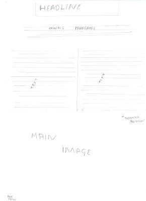
These are my flat plans for my feature article
I have kept to the typcal conventions of a magazine by keeping my text in columns. I have also added three images to keep the readers entertained, when also adding indented quotations in order to grab the attention of the readers.
Subscribe to:
Post Comments (Atom)


No comments:
Post a Comment